TikTok Careers
Campaign & Website Design
I led a complete overhaul of TikTok's global careers website, collaborating with two other designers, copywriters, a project manager, and TikTok's talent recruitment team. The project extended beyond the website to include recruitment advertising, social assets, and brand guidelines, creating a unified platform that showcases company culture while driving qualified applications across 20+ page types and multiple regions.
Role:
Lead Designer
Timeline:
14 Weeks
Team:
PM, Copywriters, 2 Designers, Stakeholders
Deliverables:
Campaign Strategy, Responsive Website, UX Strategy, UI Design, Prototype, OOH, Social
Overview
Redefining How TikTok Attracts Global Talent
TikTok's existing careers website wasn't keeping pace with the company's explosive growth. The platform needed to communicate culture, showcase opportunities across dozens of teams and regions, and convert passive visitors into active applicants.
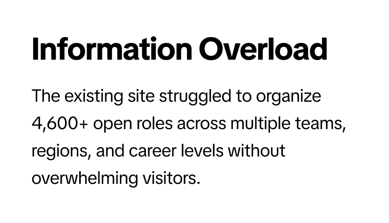
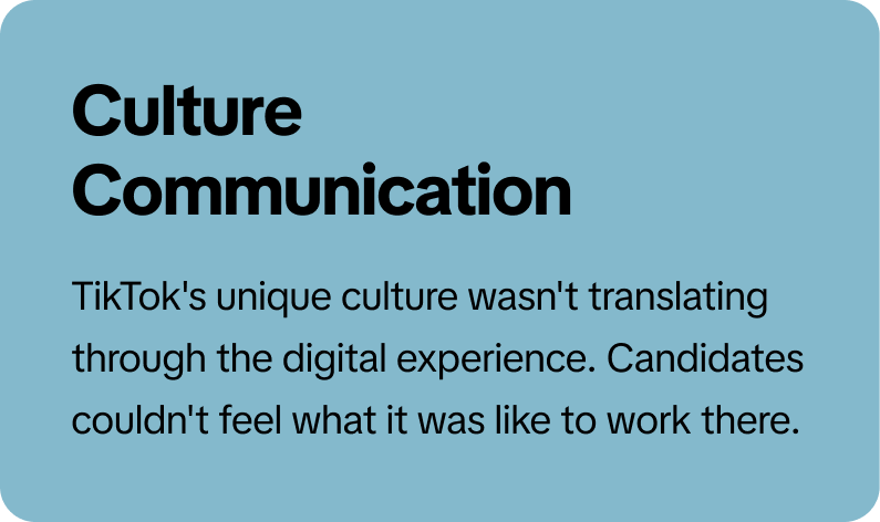
The Challenge
Scaling Culture Across a Global Platform
TikTok operates in dozens of countries with teams spanning technology, product, operations, sales, marketing, and more. The careers site needed to serve candidates at every level while maintaining a cohesive brand experience.
Process
Discovery to Delivery
I led the project through a structured design process, meeting regularly with TikTok's talent recruitment team to gather content, input, and feedback at every stage.
Discovery → 2. Research → 3. Ideation → 4. Concepting → 5. Design → 6. Handoff
Research & Strategy
Data-Driven Design Decisions
Design decisions were grounded in research: analyzing existing data, studying competitor approaches, and understanding how candidates actually behave.
Competitive Analysis
I analyzed careers sites from 12 major tech companies. Most over-indexed on job listings and under-invested in culture storytelling. TikTok had an opportunity to differentiate by leading with people and values.
Analytics Review
Existing site data revealed friction points: 68% bounce rates on team pages, "Our Values" buried three clicks deep, and a poor mobile experience for 47% of traffic.
User Research
Interviews with recent hires revealed a consistent theme: people wanted to see real employees, hear authentic voices, and understand day-to-day culture before applying.
Key Insight
The most compelling content wasn't job descriptions or benefits. It was employee voices and glimpses into actual work. This drove our "Our Voices" content strategy.
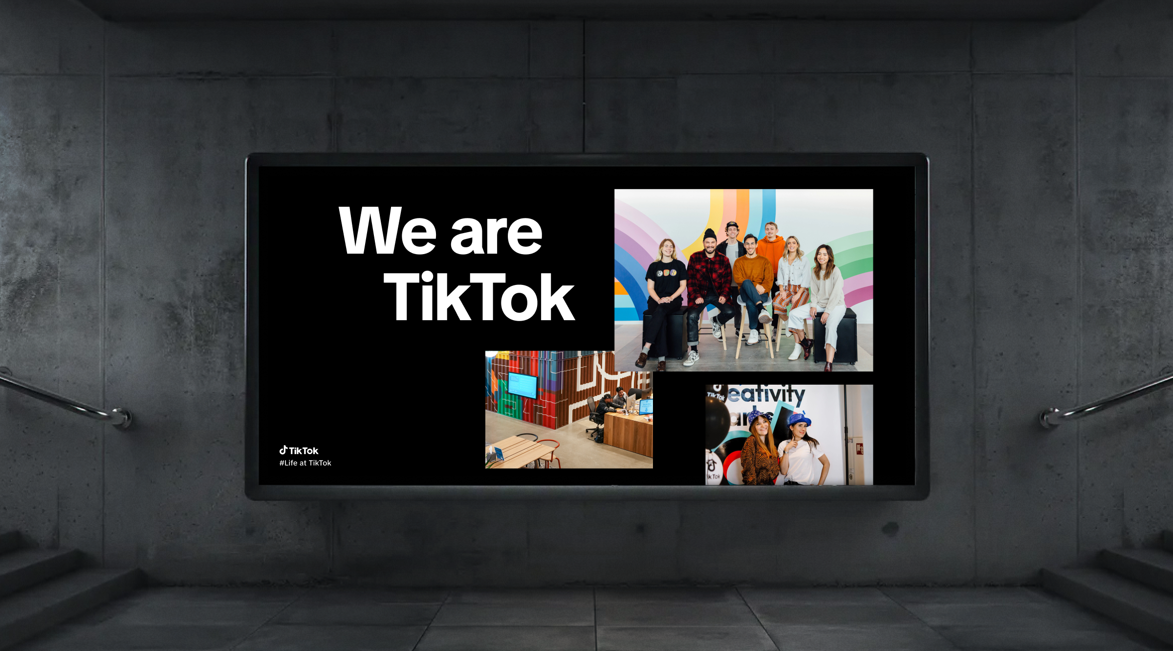
Visual System
Capturing the Spirit of the App
The visual system needed to feel unmistakably TikTok while translating the app's energy to a web experience. Beyond colors and typography, I wanted the site to mirror the vertical swiping motion that defines how users experience TikTok.
Vertical Motion & Video
Videos throughout the site scroll within their frames, mimicking the vertical swipe of a TikTok feed. Different sets of photos and videos scroll up to take their place periodically, creating constant movement. This gives the entire site a sense of energy and fun that captures the spirit of the app.
Typography & TikTok Sans
The site uses TikTok Sans, the company's bespoke typeface, in bold weights for headlines and regular weights for body copy. This creates a distinctive voice while maintaining readability across devices and languages.
Photography Direction
I defined guidelines for employee photography: diverse representation, authentic workplace settings. The imagery should feel like snapshots of real moments, not stock photo setups.
Color Strategy
While the signature black, magenta, and cyan palette creates instant brand recognition, TikTok’s secondary color palette takes a front seat here, bringing a vibrance and energy to the site and reflecting the diversity of personalities making up the TikTok team.
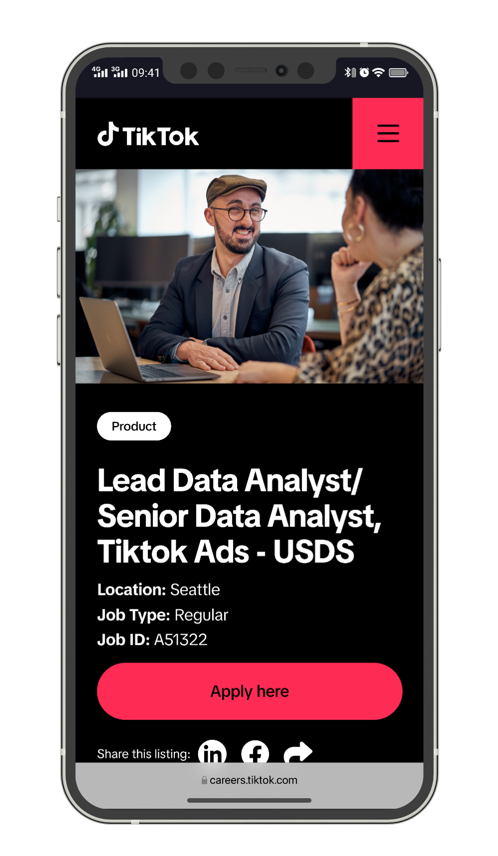
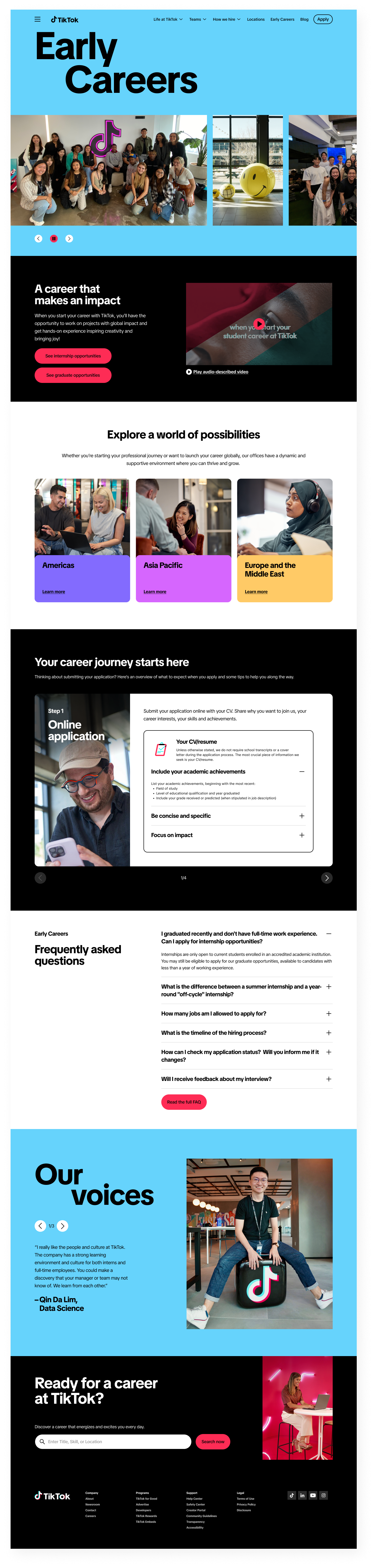
Team Landing Pages
Distinct Identity, Unified Experience
Each team has a dedicated landing page that showcases their specific culture, open roles, and employee voices while maintaining the overall site structure.
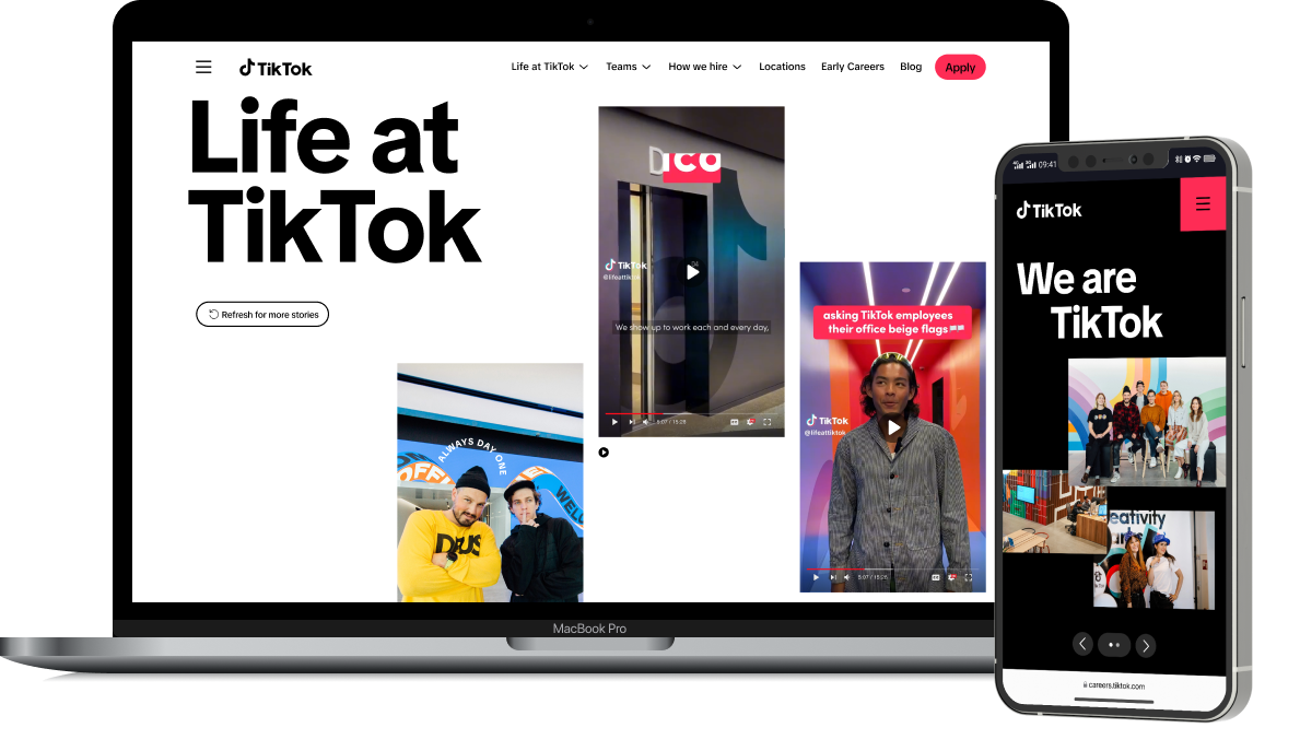
Full Site Experience
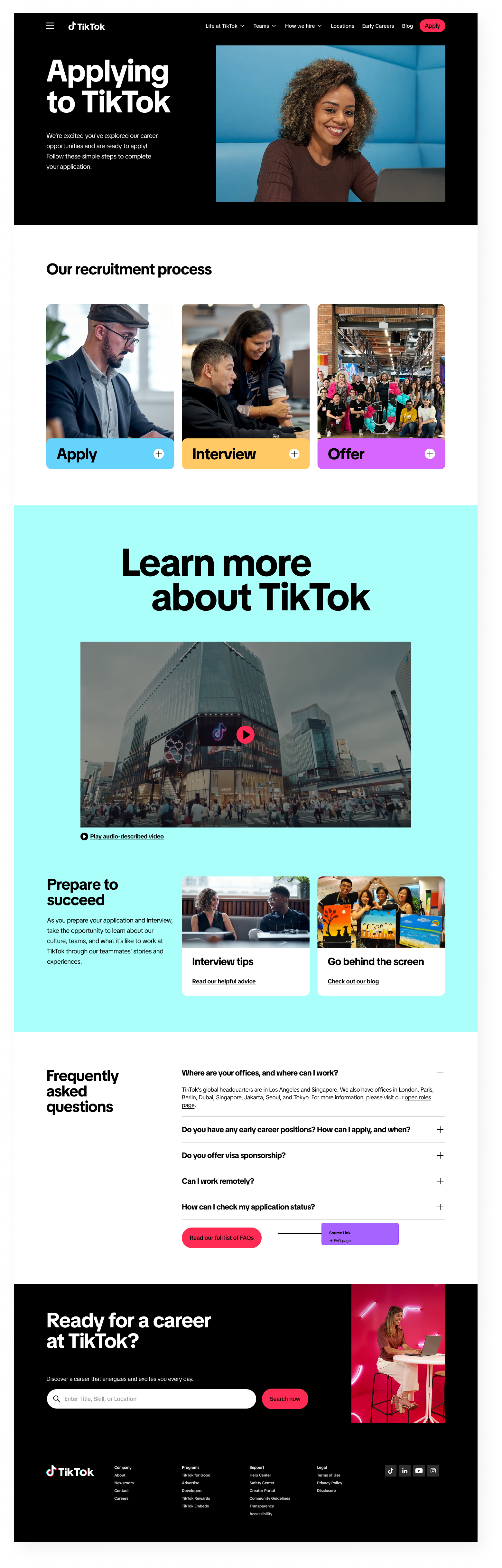
Complete Candidate Journey
Beyond team pages, the site includes content for every stage of the candidate experience, from initial discovery to interview preparation.
Multi-Channel Execution
Extending the Visual System Beyond Web
The project scope extended beyond the website to include recruitment advertising and employer brand materials that could be deployed across channels.
Interactive Prototype
Bringing the Experience to Life
I built a fully functional Figma prototype that let stakeholders experience the complete site before a single line of code was written. Every button, link, dropdown, accordion, and scroll animation worked exactly as it would in the final product.
This wasn't a simple click-through mockup. The prototype included complex interaction logic: hover states that revealed dropdown menus, accordions that expanded and collapsed, carousels that cycled through content, videos that played inline, and scroll-triggered animations throughout. Users could navigate the entire site organically, exploring any path they chose.
Interaction Design
Micro-Interactions & Motion Logic
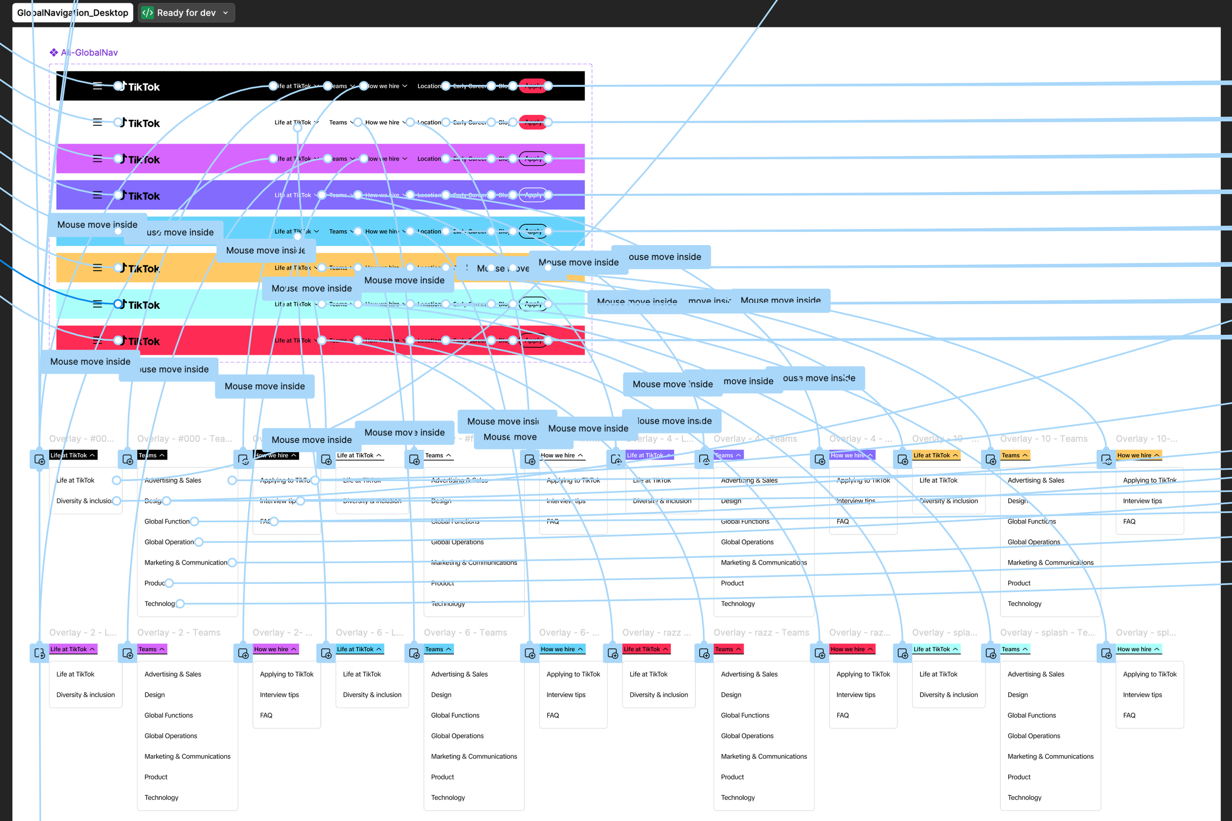
Every interactive element required careful consideration of states and transitions. The global navigation alone included 10+ variants to handle different hover states, expanded dropdowns, and active page indicators across different color contexts.
Navigation System
The navigation component handles mouse-enter triggers to reveal dropdown menus, maintains hover states across nested elements, adapts to different page contexts (dark headers vs. light headers), and provides clear visual feedback for the current page location.
Scroll Animations
Content sections animate into view as users scroll, with staggered timing for card grids and testimonial carousels. These animations were prototyped to demonstrate timing and easing to developers.
Accordion & Expand/Collapse
FAQ sections, job listing filters, and mobile navigation all use expand/collapse patterns. Each required defining open states, closed states, transition behaviors, and how multiple items interact (for example, does opening one element close others?).
Carousel Behaviors
The "Our Voices" testimonial sections, blog post carousels, and location galleries all feature carousel interactions with pagination indicators, swipe gestures (for mobile), and auto-advance timing specifications.
Navigation variants: default, hover, dropdown expanded, and color variations for different page contexts
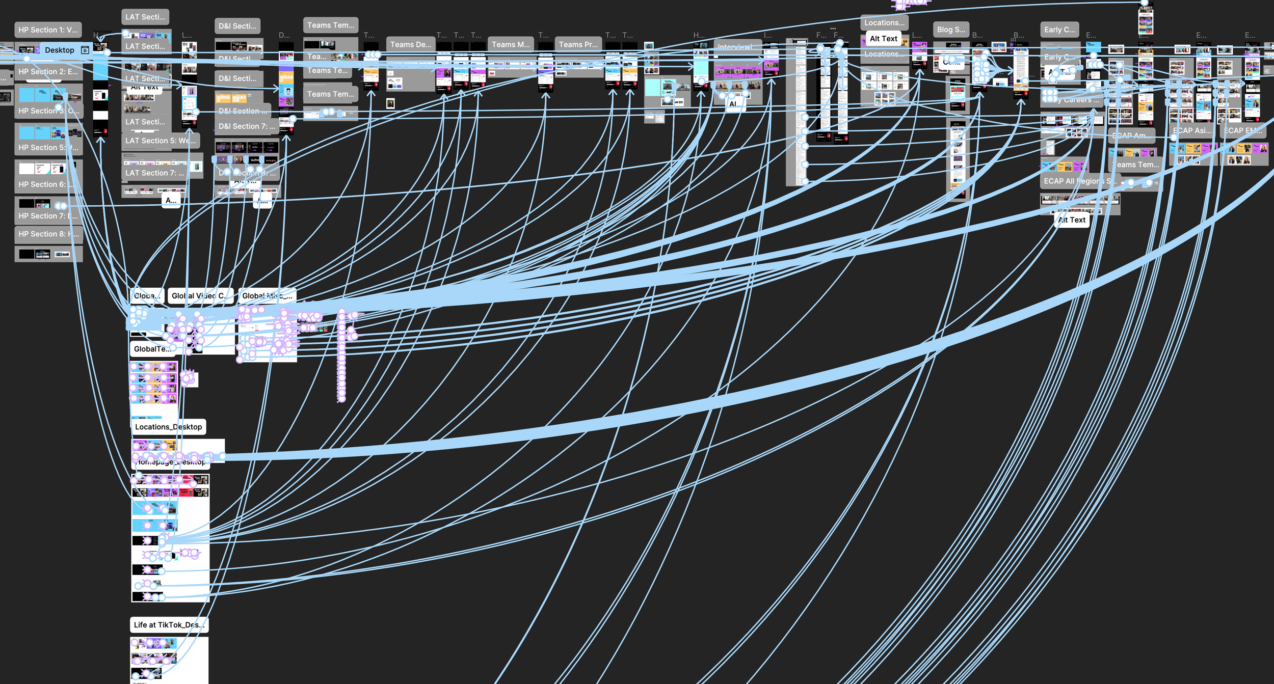
Design System
Component Library at Scale
The project required a robust component library that could scale across 20+ page types while maintaining consistency. Every element was built as a reusable component with variants for different contexts and states.
Component Architecture
Components were structured hierarchically: atomic elements (buttons, tags, avatars) combined into molecules (job cards, testimonial blocks, team headers), which assembled into page sections. This allowed rapid iteration while ensuring consistency.
Variant Systems
Key components like the "Our Voices" testimonial module included multiple variants for different color backgrounds (cyan, magenta, gold, white), different photo positions, and different quote lengths. This flexibility let each page feel unique while using the same underlying system.
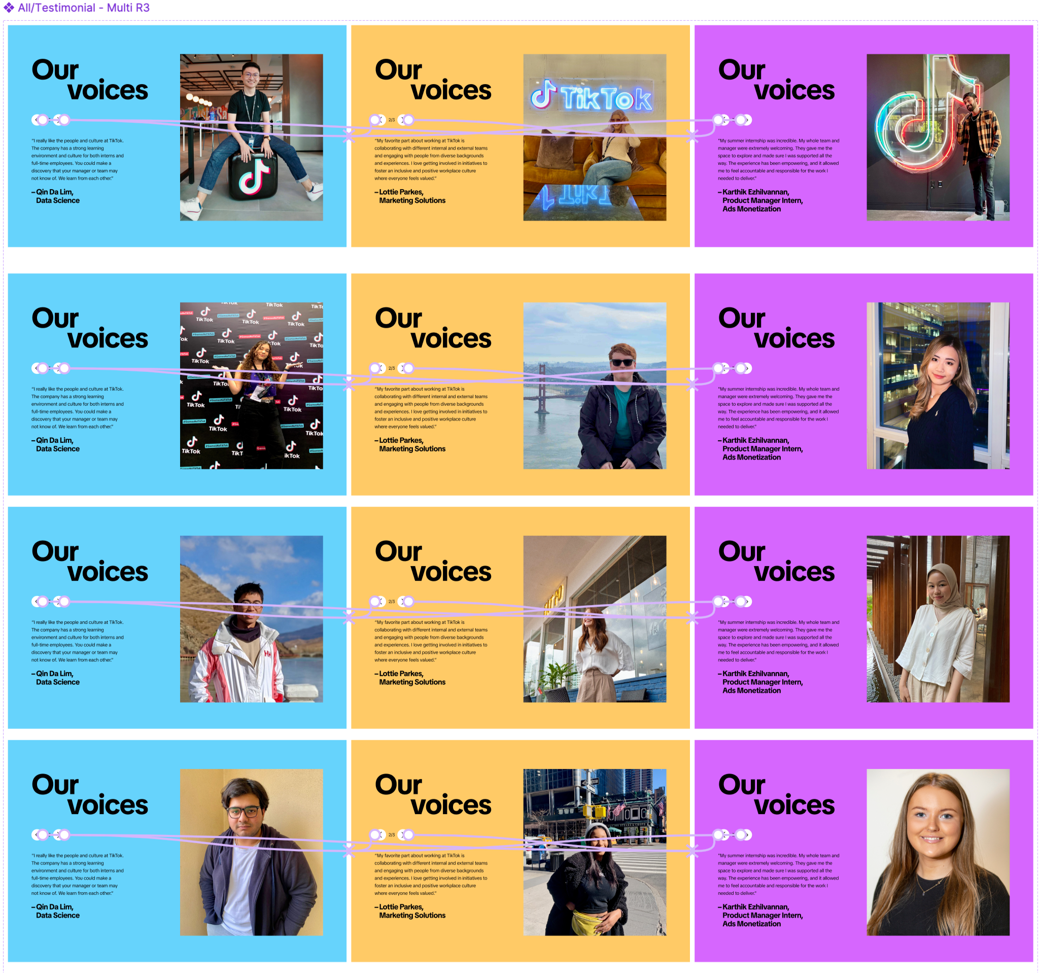
12 variants of the testimonial component covering different background colors, photo positions, and content configurations
Results
Impact & Outcomes
The redesigned careers platform launched successfully, achieving measurable improvements across key recruitment metrics.
42%
Increase in Applications
3:28
Avg. Session Duration
-31%
Bounce Rate Reduction
94
Mobile Usability Score
Reflection
What I Learned
Leading a team on a project of this scale taught me as much about communication and coordination as it did about design. The visual system only works if everyone can use it consistently.
This project reinforced several key lessons. First, employee voices matter more than corporate messaging. The "Our Voices" sections consistently outperformed other content in engagement. Second, modular systems enable scale. Creating flexible components rather than fixed layouts allowed us to address 20+ page types without starting from scratch each time.
The multi-channel aspect of this project, extending the web design into OOH, social, and brand guidelines, was particularly valuable. It demonstrated how a visual system can scale across touchpoints while maintaining coherence.