PNC PartnerUp
Brand and Website Design
PNC Bank's PartnerUp program is a career-readiness initiative that connects high school seniors with employers for skilled jobs immediately after graduation. The program offers an alternative to the traditional "college-for-all" pathway by teaching resume skills, interview techniques, and professional "power skills" directly in schools. I created a dedicated website to serve as the public face of the program.
Role:
Lead UX/UI Designer
Timeline:
8 Weeks
Team:
PM, Copywriters, Stakeholders
Deliverables:
Responsive Website, UX Strategy, UI Design, Design System
The Challenge
PNC needed a dedicated website to serve as the public face of this initiative, one that would resonate with two fundamentally different audiences: students exploring their futures and employers seeking to build talent pipelines.
The challenge was to create this digital experience from scratch while establishing a visual identity distinct from PNC's corporate brand.

User Pain Points:
For students: The path from high school to career feels uncertain. They lack awareness of viable alternatives to college.
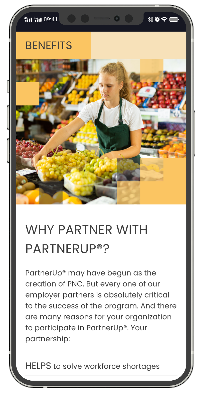
For employers: Finding qualified entry-level candidates who are work-ready is challenging. They need to quickly understand the partnership model and the logistics of participation.

Business Goals:
Increase employer participation
Drive student enrollment
Establish PartnerUp as a recognized brand separate from PNC's corporate identity
Provide clear pathways for both audiences to take action.

Stakeholder Requirements:
Reflect PNC's commitment to community investment while feeling approachable
Legal and compliance approval
Accommodate future market expansion
WCAG 2.1 AA accessibility compliance
Research
Through stakeholder interviews, competitive analysis, and conversations with program managers, school counselors, and employer partners, I developed two primary personas to guide design decisions.

Jordan
High School Senior, Cleveland • Age 16
Jordan enjoys working with computers but feels anxious about the future. His parents didn't attend college, and while teachers encourage him to apply, he's unsure if it's the right path.
He's skeptical of programs that feel like "school stuff" and responds better to concrete examples than abstract promises. He primarily uses his phone and makes quick judgments about whether content is relevant to him.
Key Questions:
“What jobs can I actually get?”
“Will this be boring?”
“Do people like me actually succeed in this?”

Michelle
Talent Acquisition Manager, Pittsburgh • Age 40
Michelle works at a healthcare network struggling to fill patient services and administrative roles. Candidates either lack basic professional skills or leave quickly for higher-paying positions.
She's heard about school partnership programs but is skeptical about the time investment. She's busy and needs to quickly assess whether a program is legitimate and worth bringing to leadership.
Key Questions:
“What’s the actual quality of candidates?”
“How much of my team’s time will this require?”
“Can I see proof this works?”
Process
Information Architecture
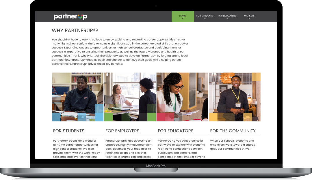
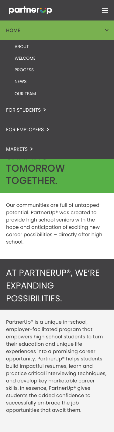
The site structure emerged from card-sorting exercises and user journey mapping conducted with stakeholders who had direct experience with both audience types. The critical insight was that students and employers have almost entirely separate information needs, so the primary navigation needed to segment these audiences immediately.
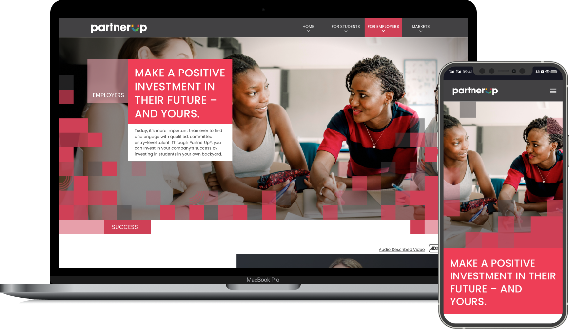
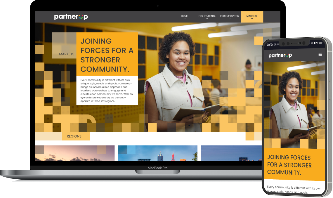
This led to the "For Students" and "For Employers" structure, with "Home" providing an overview for all visitors and "Markets" offering geographic specificity for users ready to take action in their region.
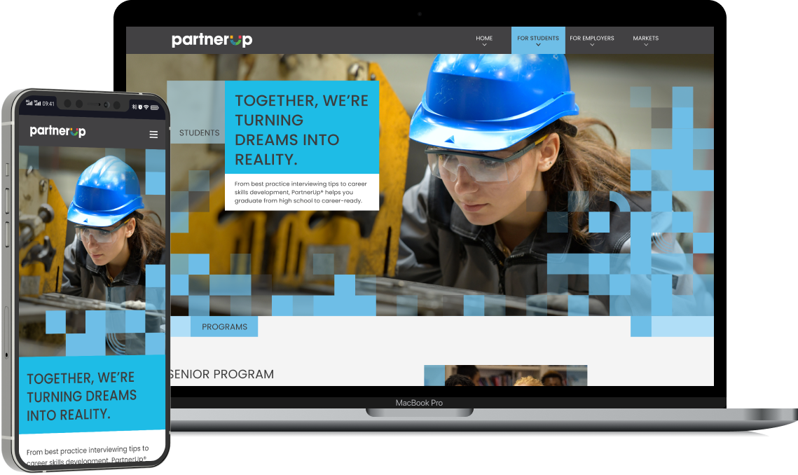
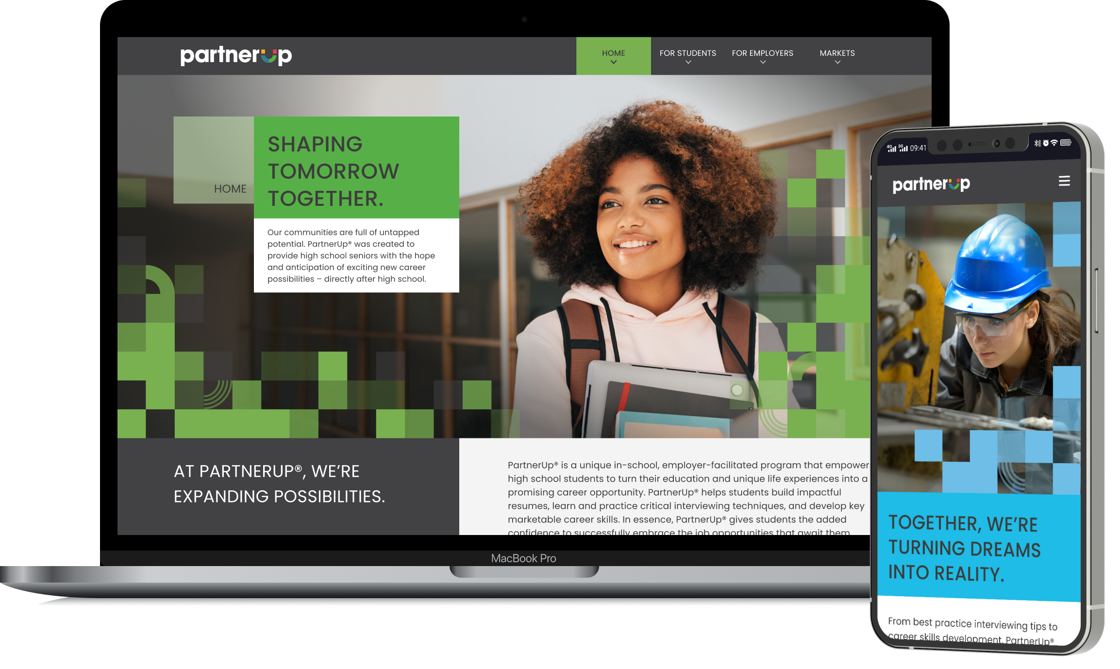
Visual Identity
The visual language needed to feel youthful and energetic without being juvenile, and professional without being corporate. This balance was essential for appealing to high school seniors while maintaining credibility with HR professionals.
The visual motif was inspired by the geometric shapes in the PartnerUp logo’s “U.” To mirror this, I chose a geometric and modern typeface, Poppins, with headlines in all-caps for added energy.


Strategy
Key design decisions - every structural and visual choice was driven by user needs and business goals.

Audience-Segmented Navigation
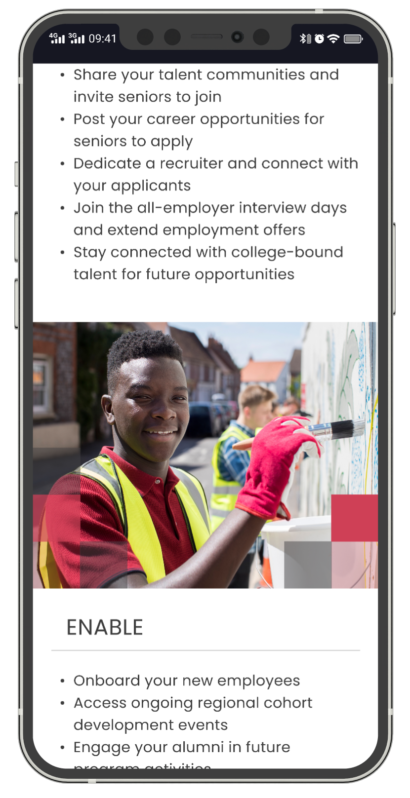
Creating dedicated "For Students" and "For Employers" sections rather than organizing by topic reduces cognitive load by immediately filtering out irrelevant content for each user type.
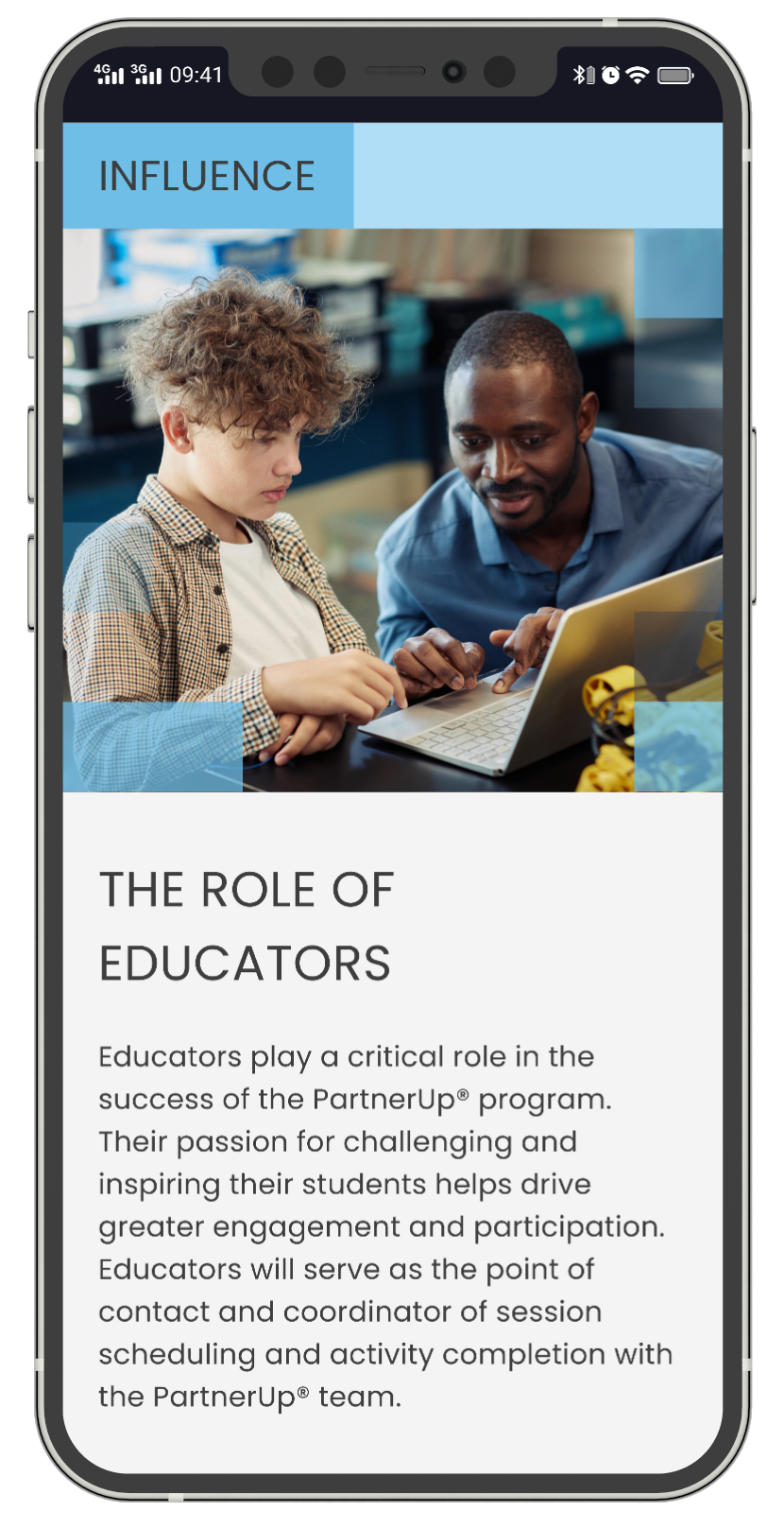
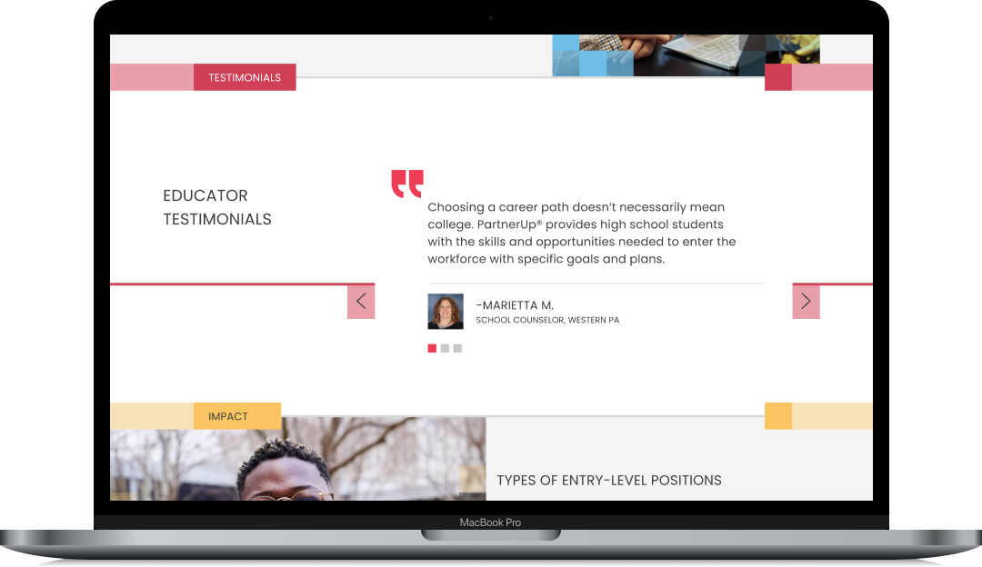
Contextual Testimonials
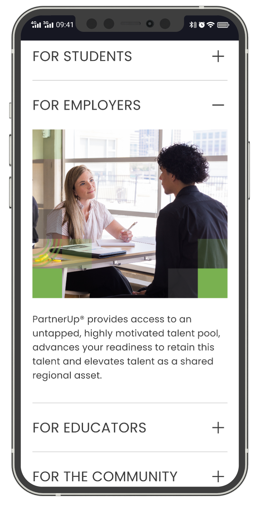
Rather than isolating testimonials on a dedicated page, student quotes appear on the student page, employer quotes on the employer page - maximizing relevance and credibility.
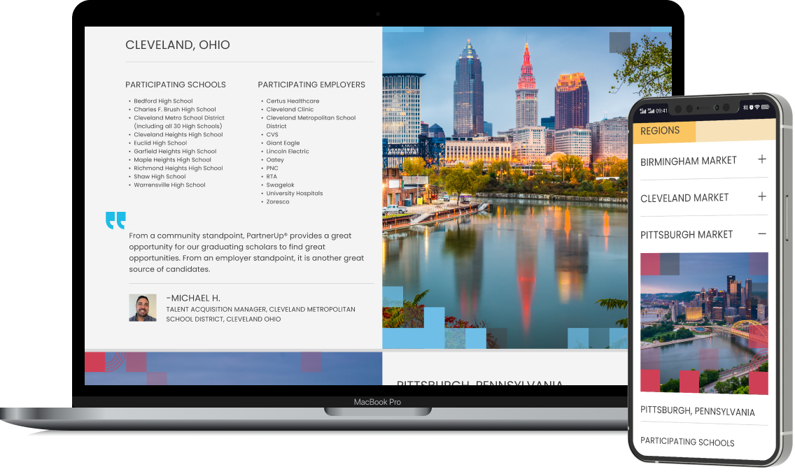
Market-Specific Architecture
The Markets page provides city-specific information including participating schools and employers, with expandable sections on mobile to prevent overwhelming users with lists.
Program Timeline Visualization
The timeline on the Home page shows the annual cycle from recruitment through graduation, helping both audiences understand when and how to engage with the program.

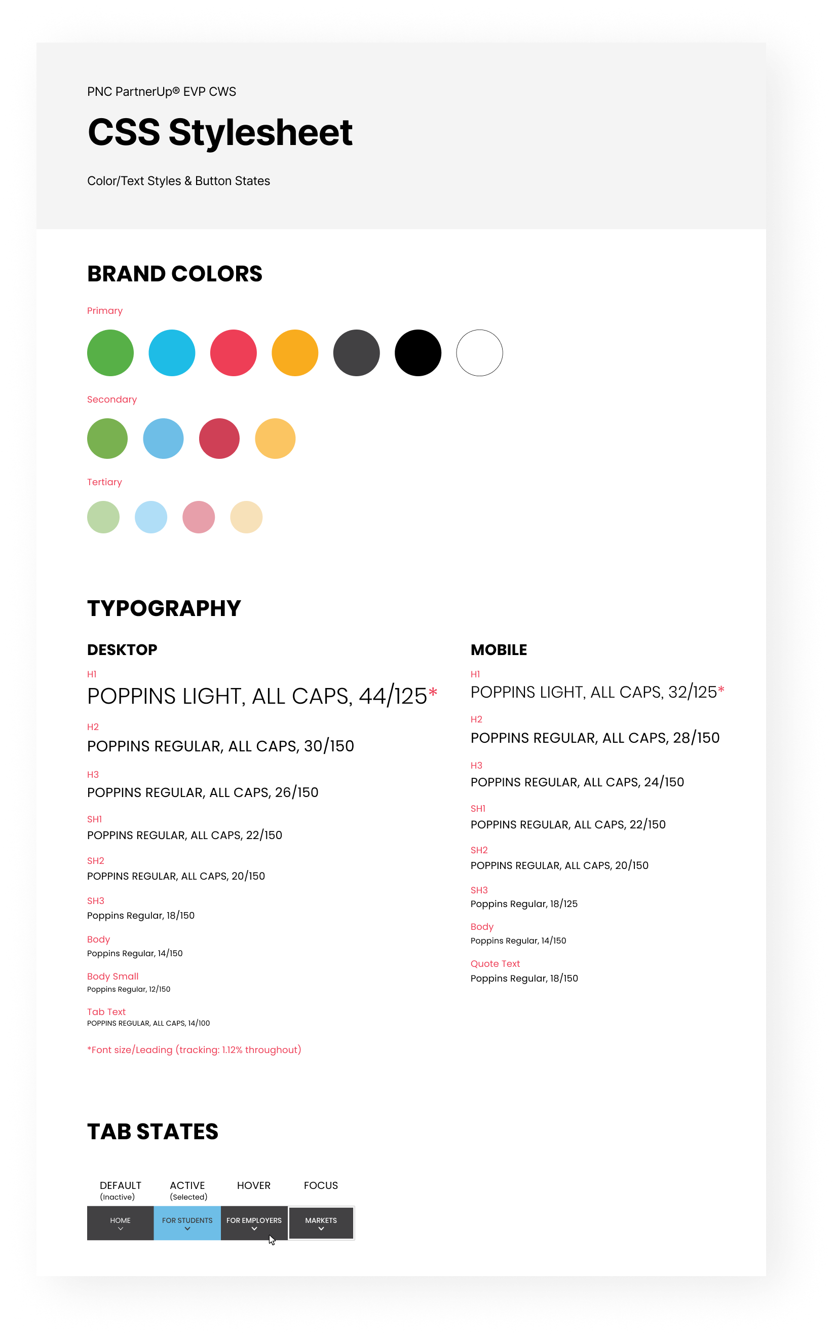
Design System & Documentation
I created a comprehensive CSS stylesheet documenting the complete design system for the development team, including the full color palette, typography specifications for both breakpoints, and interactive state definitions.
The Figma file was organized with clearly named frames, consistent component usage, and auto-layout to communicate responsive behavior. I worked directly with developers during implementation to clarify interactions and review builds.
Results
The website launched successfully and achieved its primary objectives of increasing program visibility and streamlining the engagement process for both audiences.
65%
Increase in Employer Inquiries
3:42
Average Session Duration
3.2
Pages per Session
91/100
Mobile Usability Score
88%
Task Completion Rate (Usability Testing)
Reflection
"The dual-audience challenge was the most interesting design problem to solve. Finding the right balance between a unified brand experience and audience-specific content required constant negotiation."
This project reinforced the importance of early alignment on content strategy. By collaborating closely with the copywriter and client from the outset, we avoided the difficulty of designing layouts full of “lorem ipsum” text.
If I were to approach this project again, I would advocate for user testing earlier in the process. While stakeholder feedback was valuable, direct input from high school students and HR professionals would have strengthened our confidence in key decisions.